
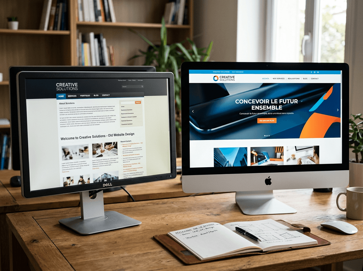
A website isn't a monument you unveil once and for all. It's a living tool that ages — sometimes fast. Visual conventions evolve, users' habits change, technologies move forward, and what looked modern five years ago can today give an impression of neglect. The problem is that this aging is insidious: you get used to your own site, you stop really seeing it, and you discover too late that it's driving customers away instead of attracting them. So how do you know when it's time to rethink everything? And above all, how do you run a redesign so that it pays off, rather than just "looking nice"? Here, without beating around the bush, are the five telltale signs — and the method we apply to turn a redesign into a profitable investment.
Redesigning isn't restyling
Let's clear up a misunderstanding right away. A redesign isn't simply changing the colors or modernizing a logo. It's rethinking the way your site fulfills its mission: attracting the right people, earning their trust and prompting them to get in touch. A site can be aesthetically pleasing yet completely ineffective; conversely, a plain but perfectly thought-out site can turn a mere visitor into a customer. The real question is therefore never "is my site attractive?", but "is my site working for me?". It's from this angle that the need for a redesign is judged — and from this angle alone.
Sign no. 1: your site isn't built for mobile
This is the most serious symptom, and yet the most common. Today, more than half of visits come from a smartphone — often far more for a shop or a restaurant. If your site forces people to zoom in, if the buttons are tiny, if a menu spills off the screen, you lose these customers before they've even seen what you offer. Worse: Google directly penalizes sites poorly suited to mobile in its rankings. A non-responsive site, in 2026, isn't a site that could be improved: it's a site that costs you customers every day, without your knowing it.
Sign no. 2: your design has visibly aged
Graphic trends change, and the public's eye with them. Dated fonts, gradients from another era, generic stock photos, a rigid layout: these details send a message you're not in control of. The visitor doesn't think "this site is a bit dated." They think, often unconsciously, "is this business still active? is it serious?". In a market where you're compared to your competitors in a matter of seconds, an aesthetic frozen in the past erodes trust before the first contact is even made. Your site is your digital storefront: it must reflect who you are today, not who you were eight years ago.
Sign no. 3: it's slow, or unstable
Users' patience is almost nonexistent. Study after study confirms it: beyond three seconds of loading time, a significant share of visitors give up. A slow site means lost customers, a penalized ranking and an image of sloppiness. The causes are many — poor-quality hosting, images that are too heavy, obsolete technology, an accumulation of unnecessary modules — but the result is always the same: frustration. If your site lags, loads in fits and starts or crashes at the most inconvenient moments, it's not a technical detail. It's a direct leak of revenue.
Sign no. 4: it no longer brings you customers
This is the most revealing sign, and the most objective. A good site generates contacts: calls, completed forms, quote requests, bookings. If yours has become a simple digital business card that no one consults, something is wrong. Perhaps it no longer appears on Google, for lack of up-to-date SEO — a topic we cover in detail in our guide to local SEO in French-speaking Switzerland. Perhaps the visitor's journey is confusing, with no clear call to action. Perhaps the content no longer answers your customers' real questions. In every case, a site that no longer converts isn't an asset: it's a missed opportunity, day after day.
Sign no. 5: your offer has changed, but not your site
Businesses evolve: new services, new audiences, new positioning, sometimes a new name. The site, meanwhile, often stays frozen in yesterday's image. As a result, a gap opens up between what you've become and what your site says. A visitor who discovers outdated information, services you no longer offer or obsolete prices leaves with a false — and rarely flattering — impression. If your business has matured without your site keeping pace, the redesign isn't a luxury: it's an essential realignment between your reality and your storefront.
A site doesn't turn bad overnight. It goes out of fashion slowly, until the day it works against you without your noticing.
Getting your redesign right: start with strategy, not design
The most common mistake is to rush straight to aesthetics — the colors, the fonts, the "nice look" — before answering the real questions. Yet a successful redesign always starts with strategy. Who do you want to attract? What action should a visitor take? What questions does your clientele ask before choosing you? What are your competitors doing, and how do you stand out from them? This framing, often overlooked, makes all the difference between a site that's merely pretty and a site that pays off. Design isn't a starting point: it's the visual translation of a clear strategy.
Preserving what already works
A redesign carries an often-underestimated risk: breaking what was working. Some pages of your current site may be well ranked on Google and bringing you visitors. Deleting them carelessly or changing their addresses without redirects means losing overnight a visibility patiently built up. A professional redesign takes care of this capital: we inventory the pages that perform, set up the necessary redirects, preserve the SEO already acquired. Rethinking a site should never mean starting from scratch on what was already paying off for you.
The mistakes that ruin a redesign
Some pitfalls come up project after project. Knowing them is already avoiding them.
- Copying a competitor. What works for them matches neither your clientele nor your positioning. A redesign should look like you, not imitate.
- Trying to say everything. A site that talks about everything convinces of nothing. Clarity and the hierarchy of information take precedence over exhaustiveness.
- Neglecting the copy. A magnificent design won't save confused content. Words — your customers' words — remain the heart of an effective site.
- Forgetting SEO. A redesign with no SEO strategy is like a beautiful shop with no sign and no street-facing window: no one finds it.
- Choosing the technology before the need. The tool must serve your project, never the other way around.
How long, how much does it cost?
There's no single answer, because it all depends on the scope of the project: a showcase site of a few pages has nothing in common with a full online store. As a general rule, a well-crafted redesign is measured in weeks rather than days — the time to properly frame the strategy, design the look, write the content and fine-tune everything. On the budget front, it's better to think in terms of investment than expense: a well-redesigned site brings you customers for years. The real cost, in reality, is that of inaction — every month spent with an outdated site is paid for in missed opportunities, quietly but surely. The chosen technology also influences the budget and how much you can manage on your own, a trade-off we detail in Webflow or Next.js: which technology for your website?.
A redesign, and then what?
Launch day isn't an end, but a beginning. A living site is nurtured, measured and adjusted: you track what visitors do, spot the pages that convert, gradually enrich the content. This is precisely what sets apart a site that climbs from a site that, once again, slowly goes out of fashion. A successful redesign doesn't just fix the past: it lays the foundations of an online presence that will keep progressing. That's why we never deliver a site only to abandon it afterward — we design it to last and to evolve with you.
If, reading these lines, you recognized yourself in one or more of these five signs, it's probably time. A site that works against you isn't inevitable: it's an opportunity to regain the advantage. A well-run redesign isn't only seen — it's measured, in visibility, in contacts and in customers. Let's talk about your current site, about what it could become, and about how it could, at last, work for you.